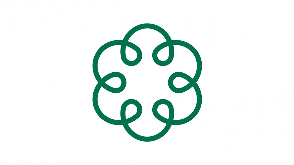
I wanted to explain a little about how this logo came into being and what it means to us.
This way I hope you can see beyond just the pretty shape of the logo and connect to the meaning of it.
We try to do the same with the way we teach and present yoga; to go beyond just the shape of the poses to a deeper connection with the meaning of yoga.
What’s behind the logo?
The design is inspired by the geometry of the flower of life, a pattern that appears throughout nature and it’s made of different elements:

The E is to represent my personal dedication to EkhartYoga.
As we’ve grown over the past 5 years I’ve stayed involved in all aspects of how we work and what we offer to our members. It’s important to me that as we offer more diverse styles of yoga and movement that I’m happy to put my name to it all. There’s a shared ethos amongst all our teachers even if we teach in different ways.
The interconnecting loops represent connection – one of our core values.
One of the things we as a team love most about EkhartYoga is the sense of connection and community that develops. The connections between teachers and members; between members as you support each other in class comments, through to your communications with us via emails or social media.
Finally, there is the heart.
Sharing the love of yoga is at the heart of everything we do. And it all comes from the heart. Our mission is to spread the love of yoga to create positive change in the world!
The new logo is all part of some improvements we’ve been busy working on in the background. We can’t wait to introduce it all to you soon so watch this space for more announcements.
With love,
Esther and the team at EkhartYoga x
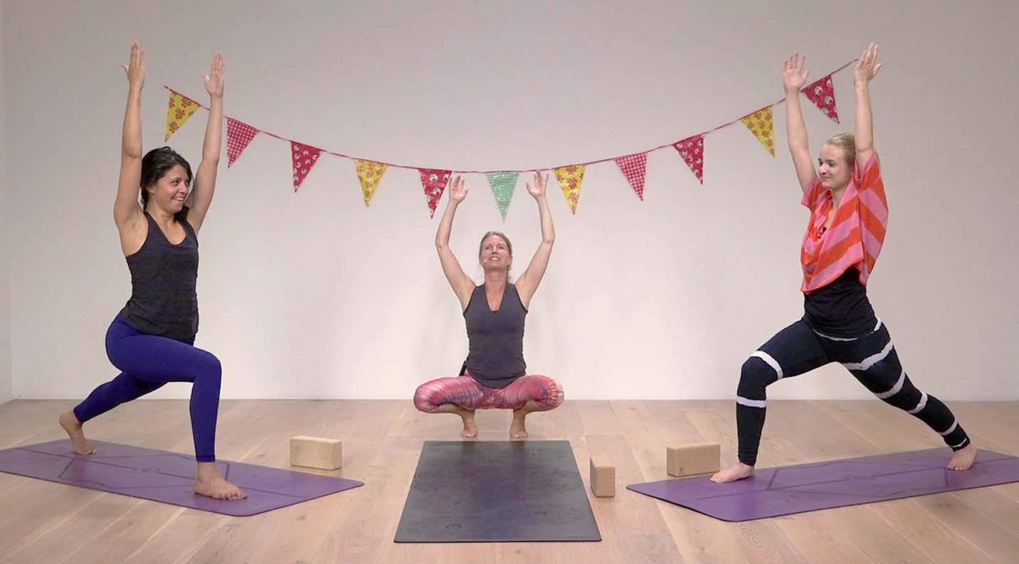
So now join me, Rotem and Lyanne in class. This class is our 3,000th on EkhartYoga!


